
UI/UX Mistakes That Quietly Kill Early-Stage Apps
Users don't file bug reports about bad design. They just leave.
 By Zetflix Product Team10 min readUpdated 2026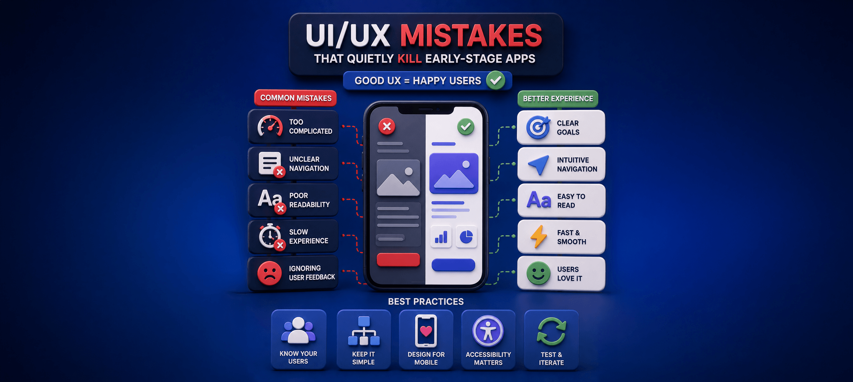
Introduction
Founders usually assume people leave because the product isn't useful enough. Sometimes that's true. But just as often, users leave because the experience feels frustrating, confusing, or harder than they expected.
The reality is that people decide how they feel about an app within seconds. If they can't quickly understand what it does or how to use it, they won't spend time figuring it out. They'll move on to something else.
Why Great UX Matters From Day One
Good design isn't about making an app look beautiful, it's about making it feel effortless.
Every screen should answer three simple questions: Where am I? What should I do next? Is everything working as expected?
When users never have to stop and think, they're far more likely to keep exploring.
Mistake 1: Onboarding That Asks Too Much
Imagine downloading a new app, only to be greeted by a long registration form, multiple permission requests, and several onboarding screens before you've even seen what the app does.
Most people won't make it that far.
The first few minutes should be about showing value, not collecting information. Let users experience what makes your product useful before asking them to create an account or share personal details.
The easier it is to get started, the more likely people are to stay.
We design architectures that ship fast today and scale cleanly later.
Mistake 2: Making Users Search for the Main Feature
Many early-stage apps make the same mistake: they hide their best feature behind menus, tabs, or unnecessary steps.
If users have to explore the interface just to discover why they downloaded your app, you've already made things harder than they need to be.
Your product's biggest value should be the first thing people notice, not something they accidentally discover later.
A simple question to ask yourself is: How many taps does it take for a new user to experience the main benefit of the app? If the answer feels too high, it's probably worth simplifying.
Worried your app's experience is costing you users?
We run focused UX audits that pinpoint exactly where people drop off.
Mistake 3: Feature Overload
Founders love features; users love clarity. It's tempting to showcase every feature your team has worked so hard to build.
The result is often an interface that feels crowded instead of powerful.
Users don't need to see everything immediately. They need to accomplish one task successfully, build confidence, and gradually discover more as they continue using the product.
The most successful apps don't overwhelm people with options; they guide them step by step.
Mistake 4: Ignoring Empty and Error States
New users always see your app at its emptiest — no data, no history, nothing. A blank screen with no guidance is a dead end, yet these states are routinely an afterthought. The same goes for errors: a generic "Something went wrong" tells the user nothing and erodes trust.
Design your empty states to teach and invite action, and your error states to explain and offer a way forward. These moments are where good apps quietly reassure users and bad apps quietly lose them.
Sometimes, the "boring" choice is the one that helps your startup move the fastest.
How to Catch These Before Launch
Some of the most important screens in an app are the ones teams spend the least time designing.
What happens when a user opens the app for the first time and there's no data yet? What happens when something goes wrong? What happens if their internet connection drops?
An empty screen with no guidance feels like a dead end. A vague error message creates uncertainty and frustration.
These small moments may seem unimportant, but they're often where users decide whether your product feels polished and trustworthy.
Articles you might like



Ready to Launch Your MVP?
Stop reading and start building. Our team is ready to turn your vision into a viable product.